
I was thinking of replacing the classic Verdana font by a pixelated one.
I just bought font "Loser" by Eeve Somepx to make some tests, here are the results:
Verdana (12 anti-aliased)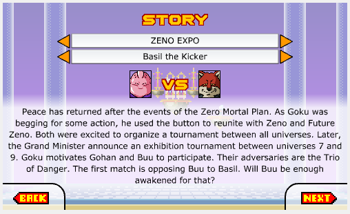
Loser (15 pixelated)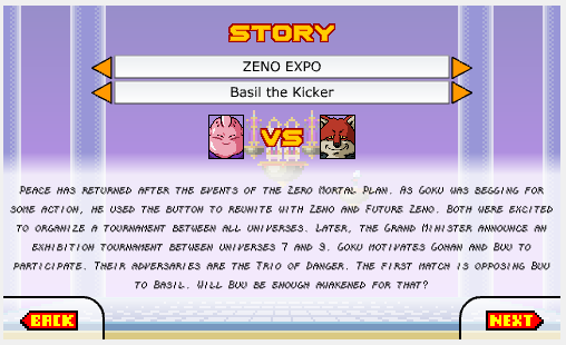
What do you think of it?
The second one looks great of course, but isn't it less readable?
Yeah, it is. That's the kind of fonts that are better for titles and buttons. It's just to show pixelated fonts against anti-aliased fonts.
As for the Verdana, I can display it at size 11 and without antialiasing too. I think it's good. There are some lines that are blurry, but it's only happening on my office screen, might be a DPI problem, I don't know...
Verdana (11 pixelated)
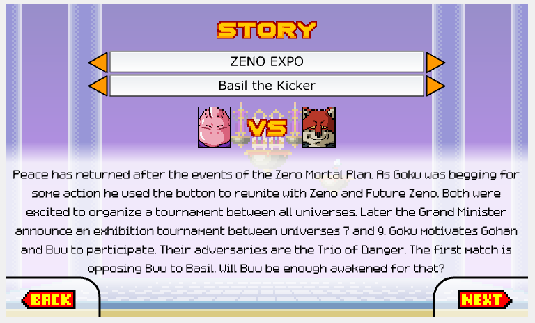
I pushed this modification to the beta so you can try on your screen and post a screenshot when you have the time. It's only modified in the Story text.
Fonts Match 7p and 8p are really nice, but I don't know why some lines of text are blurry. The blurry lines aren't even the same as the previous screenshot. Flash is a mess for that...
Match 8p (16 pixelated)
Yes! I've been thinking about this a lot lately! It looks very good and I think it helps a lot to the game's overall aesthethic. I also find it good that as it is a smaller font the paragprahs are smaller and less "intimidating" 😀
(Talking about the loser font)
The pixelated fonts aren't blurry when they are in a new Flash project. So it should be doable in DBDEV with a lot of boring try and repeat...
Match 8p and Loser
So the blurriness problem really comes from the screen DPI. It's nothing I can fix...
Here's the Match 8p font on another computer:
I've been reading around the story mode for a bit now with the latest font for the beta. I must say this last one is perfect. At least in my navigator with and withouth fullscreen the letters look absolutely great and completely readable.
Cool 🙂
I think you are talking about Verdana (pixelated).
It's the same font as ever, but pixelated. Tomorrow I'll push another build with Match 8p (the one in my last screenshot), for testing. I really like that one.
I honestly think that the current texture is better. Way better actually
And you told me this yourself. "If it works, don't change it" so changing it is not neccesary
But it's your choice guys 🙂
x2 a MDragonX, prefiero la fuente actual Verdana (pixelated)o en su defecto, Match8p.
La fuente Loser en la captura del juego se ve demasiado inentendible y la font al ser muy delgada y con letra itálica/cursiva hace que sea más complicado de leer tanto para quienes jueguen en teléfonos como para quienes tengan que usar lentes.
Una font más tradicional como Verdana o Match8p evita esa clase de problemas y hace que sean más entendibles los textos del juego 😁
Top one = Verdana (12)
Bottom one = Match 8p (16)
I pushed a beta version with Match 8p as the story text font, for reading tests.
Zoom on it, read several paragraphs, then tell me what font you prefer between those two.
Verdana (12)
I'd say I prefer Verdana (12) too!
By the way, are you planning on
changing the font of other texts in the game after the story texts?