
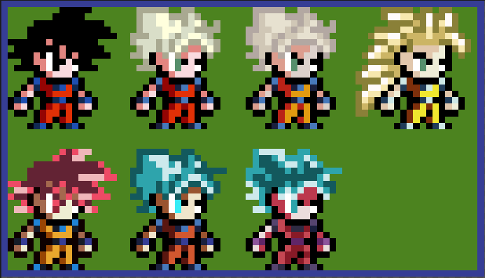
a project that I think about doing based on my Goku of the images, to clarify the colors are from the anime and in my opinion they were good, For that I want your opinion that they would change to make it look better, another thing is that the color difference in the Super Saiyan trade is almost nil (except for the buu and super saga)
They look good, I like the idea you had about using anime colours, although you can’t use Z colours and Super colours in the same one as they don’t look consistent. And if you do Z colours, you are using a very inaccurate super saturated version of the Z anime. Which unfortunately is the easiest one to find, and the original English dub had that saturation turned up to 11 for the horrible home releases.
You should try to find the Dragon Box versions of the anime and look at those colours. Even if you don’t, at least change SS1 and 2, especially 2 as it looks too dusty and those two forms in the Buu saga had the same colour hair without any aura.
Which is another point, make sure all your poses are not glowing as the aura only shows up with you charge ki (unless you are going to draw your own aura on at all times). You’ve definitely done that correctly with base, SS1, SS2 and SSB. But SSG is glowing too much, although in the BoG movie and Super arc, his clothes did turn a much brighter orange, that changed later in the ToP, so you should make his clothes the same colour as you made SSB. SSB Kaioken should also not be covered in red light as he doesn’t have his aura on and we know Kaioken doesn’t constantly have the aura activated, but I guess you could draw the aura around him so you don’t forget it’s Kaioken when standing still so you can keep him glowing. SS3’s hair is also just a bit off in the shade of yellow.
Despite all the ‘criticism’ up there I do like these designs, the colour is just a nitpick of mine and fixing some of this issues whether it be consistency or accuracy will definitely improve them.
Pages: 1